HAHA, but we know we do, don't we? It's the first thing we see, that little spark that catches our eye, and we can't help but be superficial when it comes to picking out books. Or at least I can't.
The story is the most important element of any novel, so don't get me wrong, but you gotta market it, and that means you gotta make it look good.
That saying, "Don't judge a book by its cover," only really works when used as a metaphor to describe people, dogs, cats, or anything that's living and gets handed a genetic code they can't change. The cover of a novel, on the other hand, should reflect what's inside. This is something authors and publishers have control over, and they should take pride in it. What's the point in working your ass of to write this incredible story when people might just skim by a weak cover and pass it up? Make that baby strong, appealing, and breathtaking. It's a work of art and should be treated as such.
Example:
It's not bad.... I guess... but, I mean, c'mon, this book is about four women whose lives get cut short by their husbands, and their anger transcends death. That's pretty heavy stuff, and the cover just doesn't do the synopsis justice. (Check it out.)
It's a book I definitely would like to read after reviewing the little blurb, but initially, I passed it up. From what I gather through my own reading habits, the book collecting process occurs in steps.
- See the cover...
- Read the synopsis...
- Get freakishly excited and buy that sucker...
There are SO many books out there just waiting to be read, so it's imperative have a cover that stands out among the crowd. I don't know about you, but I'd rather spend my time reading books rather than thousands of synopses just to keep my risk of being shallow low. And that's where the covers come in. I see what catches my eye and go from there.
I'm not a designer, so I don't have any real advice on how to create that eye-popping cover, but from what I can tell, simplicity works just as well as complexity.
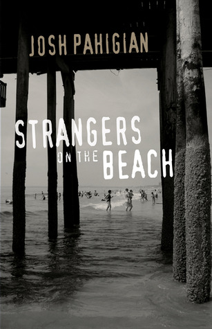
Check this one out...
So simple. But it's eye catching with it's black and white color scheme and a font that exudes mystery and danger. The beach looks harmless enough, fun even, but the shadows cast by the pier give it a dark look, as if there is something lurking behind the smiling faces and splashing children. You can immediately determine that this novel will be full of suspense and thrills. (GoodReads)
"What you see is what you get." That's the phrase that comes to mind when I think about what makes people buy one product over another. Books are more than just a product to a book lover like myself, but it's the same concept. People are more likely to be drawn to what attracts them the most. And not only that, but like I said before, authors work their passionate tails off to make the content of their book extraordinary... And that work deserves to be showcased and represented by a cover that's just as magnificent.
What's your opinion? Do you look for what catches your eye or do you go by the synopsis alone?
Happy Reading Everyone :)
~ Keely ~


Well said. 1st cover catches my eye then read the back. I have read many 5 star novels with not so appealing covers but I also have read 2 to 3 stars novels that have the sexiest or most eye catching cover.
ReplyDelete@Wickedly Delicious I can totally relate ~ covers don't necessarily reflect the contents, but being visual creatures, we totally need something to draw the eye... according to the poll, there are zero votes for people who go by synopsis and content alone...
ReplyDelete